How to Predict Political Leanings: Start with SNS Data and Network Analysis
Are you looking to uncover the hidden patterns and meanings within the complex structure of retweets, mentions, and follow networks on social media? With NetMiner 5, you can easily conduct network analysis based on SNS data, as well as apply graph machine learning techniques.
From structural analysis using quantitative indicators to sophisticated predictive modeling and intuitive visualizations!
all of it can be done within a single workflow, without any coding required ~
In this tutorial, we will use Twitter data as an example to explore how to classify users' political orientations with NetMiner 5.
Section 1. Understanding the Structure of Political Discourse on Twitter
In this tutorial, we will use Twitter data to predict users' political orientation by applying the GraphSAGE model—one of the graph machine learning algorithms newly supported by NetMiner 5.
On Twitter, users often use hashtags to express specific campaigns or intentions, and they tend to retweet posts that resonate with their own opinions. This behavior naturally leads users with similar political views to form tightly connected groups through retweet activity. By leveraging these patterns, we can build a predictive model that classifies whether users support or oppose a specific candidate (Candidate A).
A. Introduction to the Twitter Data
First, let’s begin by introducing the user node set used in this analysis.
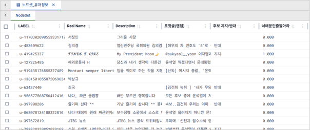
The dataset consists of a total of 578 nodes.
The next step is to introduce the retweet network data between users.
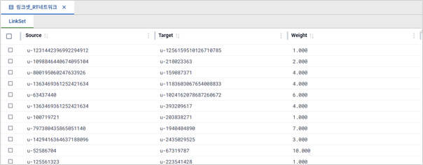
The network consists of a total of 4,250 links.
Each Source and Target node represents a user ID, and the Weight indicates the number of retweets from the Source user to the Target user.
For example, user u-1231442396992294912 has retweeted user u-1256159510126710785 once, while user u-52586704 has retweeted user u-67319787 ten times.
B. What’s the Public Sentiment Toward Candidate A? – Exploring Support vs. Opposition
Let’s start by examining the distribution of support and opposition toward Candidate A using a pie chart.
Visualize > Chart
Select the dataset you want to visualize from the right-hand panel.
Choose "Pie Chart" as the chart type.
Set the Y-axis to the "Support/Opposition for Candidate A" attribute, then click Run Layout.
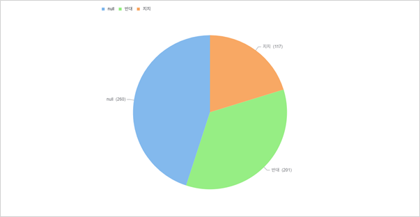
[Public Opinion on Candidate A]
117 users expressed support, 201 users showed opposition, and 260 users did not state a clear stance.
Now, let’s take a look at the retweet network among users through network visualization.
Visualize > Network > 1 Mode
In the right panel, select the node set and the 1-mode network (retweet network).
Choose a layout algorithm and click Run Layout.
Under the Style > Node tab, change node colors: red for opposition, blue for support, and green for undefined.
Under the Style > Link tab, adjust link thickness based on the WEIGHT value.

[Retweet Network Overview Among Users]
The network visualization reveals that users with similar political orientations tend to form distinct clusters, indicating a strong tendency toward ideological homophily.
Section 2. Network Analysis Using Retweet Relationships
A. Support vs Opposition by Community
We will conduct a Louvain community analysis based on the user retweet network and examine the distribution of support and opposition for Candidate A within each community.
- Network > Subgroup > Community > Louvain
Select the 1-mode Network (retweet network).
Since the network is undirected, do not check the Symmetrize option.
Check Use Weight to derive the community structure based on the strength of connections, not just the number of links.

[Louvain Community Analysis Results]
A total of four communities were detected.
Click Add to Dataset > Node Attribute under [T]Community (Louvain) and then click OK to add the community analysis results as a new attribute to the user node set.
Assign Community 1 to red, Community 2 to blue, Community 3 to yellow, and Community 4 to green, and then check the community distribution through network visualization.
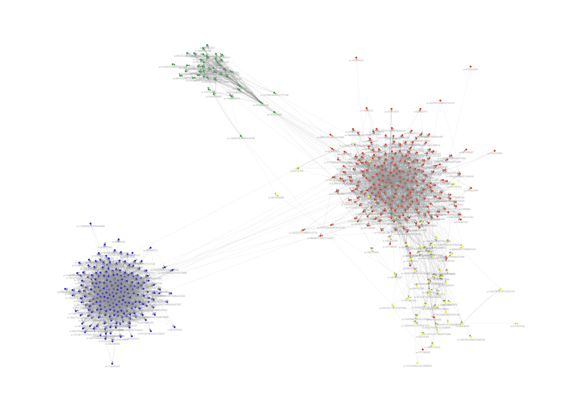
[Louvain Community Visualization]
Compared to the network visualization in Section 1, it can be observed that Communities 1, 3, and 4 are mainly composed of users opposing Candidate A, while Community 2 is mainly composed of users supporting Candidate A.
B. Understanding the Influence Structure of the Retweet Network: Centrality Analysis
We will perform a centrality analysis using the retweet data between users, and then add the results to the user node set as attribute information.
Network > Centrality > Degree/Closeness/Betweenness
Select the 1-mode Network (retweet network).
Chenck Use Weight/Wasserman-Faust Adjustment/Use the Weight as Distance.
Since the network is undirected, the In/Out centrality values are the same.
- Under [T]Degree Centrality, click Add to Dataset > Node Attribute, check In-Degree, Closeness, and Betweenness Centrality, then click OK.
You will see that the centrality analysis results have been added to the user node set as attribute information.
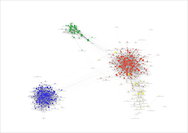
[In-Degree Centrality]

[In-Closeness Centrality]
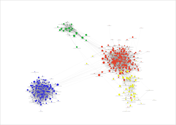
[Betweenness Centrality]
Section 3. Predicting Political Leanings from Retweet Structures: Using the GraphSAGE Model
In Section 1, we identified 260 users whose stance on the candidate (support/oppose) was not specified.
Therefore, we will use GraphSAGE, one of the graph machine learning algorithms, to train a model on the 318 users with known stances and predict whether the remaining 260 users support or oppose candidate A.
A. The First Step in Analysis: Splitting Data into Training and Test Sets
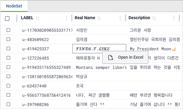
Right-click on the user node set screen and select Open In Excel.
In the Excel window that opens, you'll see the user node set including the results of the network analysis.
Separate the nodes into training and test datasets based on whether the Candidate Support/Opposition column has a value or not, and then import them back into NetMiner 5.
※ When importing the data, go to Choose Data Type, click on More, and set the Value Type of the Community (Louvain) Partition column to TEXT before completing the import.
※ You can also use a Query to split data. “Candidate Support/Opposition” != ( or ==) Null will divide the nodes into those with values and those without, just as described above.
B. Training the GraphSAGE Model
First, we will train the GraphSAGE model using only the hashtag attributes utilzed by each user.
Machine Learning > Learn (Graph) > GraphSAGE
Select the 1-mode Network (Retweet Network) corresponding to the training data.
In Variable to Predict, specify the dependent variable: “Candidate Support/Opposition”.
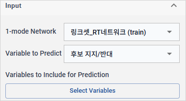
In Variables to Include for Prediction, check only the 102 hashtag attributes and click the Select button.
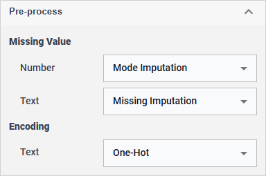
In Pre-process, specify the conditions for handling missing values and text data.
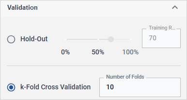
Set the evaluation method to k-Fold Cross Validation and enter 10 as the number of folds.
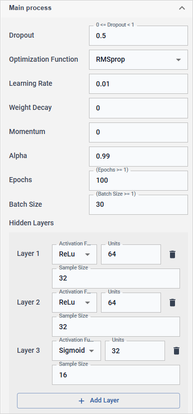
In the Main process, configure the parameters of the GraphSAGE model.
Click Run process to execute the GraphSAGE model.
After reviewing the training results, click Save Model to save the trained model.
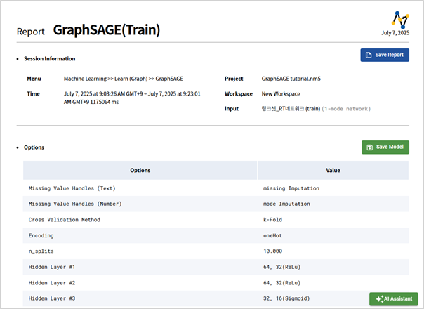
[GraphSAGE Training Results Screen]
Following the same procedure, we will create additional models by combining hashtags with centrality analysis results, hashtags with community analysis results, and hashtags with both centrality and community analysis results. In total, four models will be generated and their performance will be compared.
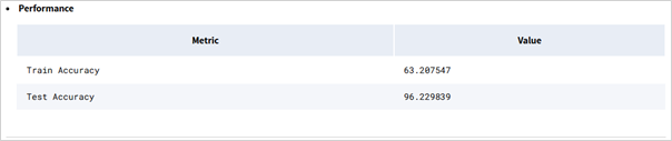
[Hash Tag]
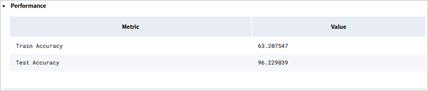
[Hash Tag + Centrality Analysis]
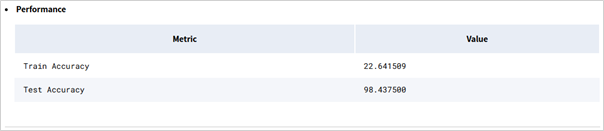
[Hash Tag + Community Analysis]
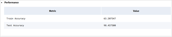
[Hash Tag + Centrality Analysis + Community Analysis]
The GraphSAGE model using hashtags and community analysis results showed the lowest accuracy, whereas the model that utilized hashtags, community analysis, and centrality analysis together demonstrated the highest performance.
C. Predicting Read Data Using the Trained Model
Now, using the fourth trained model—which showed the best performance—we will predict the political stance (support or opposition to Candidate A) of the 260 users whose opinions were previously unknown.
Machine Learning > Inference
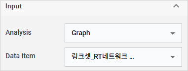
In the Analysis panel on the right, Select Graph as the analysis type. For Data Item, choose the 1-mode network data consisting of the 260 users whose labels were not assigned.
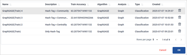
In the Main process, click the Select Model button and choose the previously saved fourth model.
The inference results can be viewed in [T]Prediction Table.
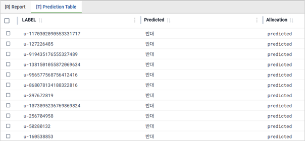
[Inference Results]
By applying the trained GraphSAGE model to real-world data, you can predict missing values, uncover hidden insights, and enable more precise decision-making—such as developing targeted strategies.
※ The data used for prediction must have the same structure as the data used during model training. In other words, if there is no trained model compatible with the prediction data, no results will be displayed. The independent variables used in the training model must also exist in the prediction data.
※ Related Tutorial
☞ Revealing Hidden Structures: A Hands-On Tutorial on SNA Visualization
☞ Predicting Twitter User Tendencies with Graph Machine Learning