Revealing Hidden Structures: A Hands-On Tutorial on SNA Visualization
NetMiner 5 offers a comprehensive suite of features that includes not only various network analysis methods and both machine learning and graph-based machine learning, but also interactive visualizations that provide an at-a-glance overview of your data.
SNA (Social Network Analysis) visualization goes beyond generating simple graph images—it intuitively reveals complex relationships and patterns hidden within the data structure, offering researchers practical insights and analytical value.
In this tutorial, we will explore how to use NetMiner 5 to incorporate analysis results into rich, insightful network visualizations.
Section 1. What You See Shapes How You Think: The Value of Visualization for Researchers
A. Insights Gained from Network Visualization
When analyzing complex relationships, it is essential not only to perform network analysis, but also to present the results in a visually interpretable form to support meaningful thinking and interpretation by researchers and stakeholders.
Network visualization provides researchers with the following key insights:
Identification of key individuals or nodes
Understanding of group and community structures
Recognition of connection patterns and information flows
Detection of outliers or isolated nodes
Tracking of structural changes over time
Data-driven storytelling
It plays a critical role in delivering research findings persuasively to external audiences, as a single well-crafted network image can often convey complex structural dynamics that quantitative metrics alone cannot. This makes it highly effective in various contexts such as reports, presentations, academic papers, and policy proposals.
In short, network visualization is more than just a display tool—it is an essential research instrument that deeply supports the entire process of thinking, questioning, communicating, and persuading.
Section 2. Network Analysis Using Relationships Between Political Blogs
A. Introduction to the Polblogs Dataset
In this tutorial, we will conduct network analysis using the Polblogs dataset, one of the sample datasets provided by default in NetMiner 5.
Let’s begin with a brief introduction to the dataset.
The Political Blogs Dataset(Polblogs) is a widely used example in social network analysis and graph-based research. It is a directed network based on the hyperlink structure between political blogs in the United States, collected around the time of the 2004 presidential election.
※ Source: L. A. Adamic and N. Glance, "The political blogosphere and the 2004 US Election", in Proceedings of the WWW-2005 Workshop on the Weblogging Ecosystem (2005)
You can load the polblogs.nm5 file from the following path:
C:Users(Username)NetMiner 5SampleDataMark Newman Datasetpolblogs
Let’s take a quick look at the basic structure of this dataset.
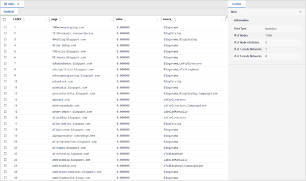
Each node represents a political blog that was active around the time of the 2004 U.S. presidential election, and the network consists of a total of 1,490 nodes.
The Value attribute indicates the political orientation of each blog: 0 represents a liberal(left-leaning) stance, and 1 represents a conservative (right-leaning) stance.
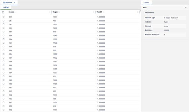
This is a directed network dataset represented in the form of an edge list, showing the link relationships between blogs.
A total of 19,090 directed connections (edges) are present in the network.
B. Polblogs Network Centrality Analysis
Now, let's begin the centrality analysis using the Polblogs network data.
Go to Network > Centrality > Degree Centrality
In the right control panel, under Input, select the network that represents the connections between blogs, then click the Run Process button.
In the [T] Degree Centrality result window, click Add to Dataset > Node Attribute.
Make sure both In-Degree Centrality and Out-Degree Centrality are selected, then click OK. The centrality values will now be added as new attributes in the node set.
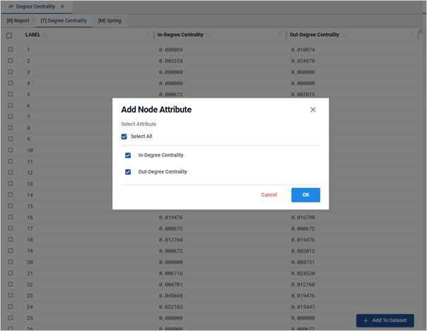
Repeat the same steps to perform Betweenness Centrality and Closeness Centrality analyses as well.
C. Component and Community Analysis of the Polblogs Network
Next, to explore the cohesive structure of the blog link network, we will first perform a component analysis, then extract the giant component and examine the community structure formed within that network.

Go to Network > Subgroup > Component.
In the right control panel, select the 1-mode network as input.
Since this is a directed network, set the Component Type to Strong Component to account for directionality, and set the Minimum Size of Component to 2.
Click the Run Process button to view the component analysis results.
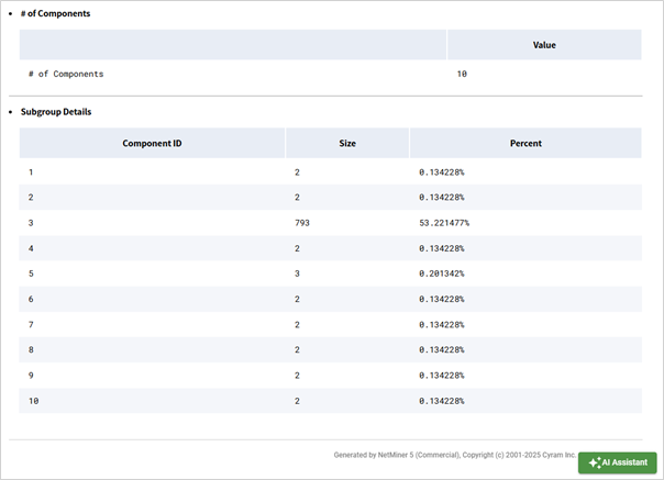
A total of 10 components were identified. Among them, Component 3 contains 793 nodes, accounting for approximately 53.2% of all nodes.
Now, let's extract only Component 3, which is the largest (giant) component.
In the [T] Component result window, click Add to Dataset > Node Attribute. The component ID will be added as a new attribute to the node set.
Go to Tools > Query, or click the { } icon at the top of the screen.
Select the Main node set, click Component Partition, and extract only Component 3.

Add the nodes in Component 3 and their associated network to a new workspace.
To identify the community structure within the extracted giant component network, we will perform Louvain community detection.
Go to Network > Subgroup > Community > Louvain
In the right panel, select the 1-mode network to be analyzed
Make sure the Symmetrize option is unchecked to preserve directionality, then click the Run Process button.
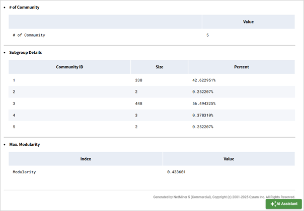
The network was divided into a total of 5 communities. Among them, Community 3 included 448 nodes, accounting for approximately 56.5% of all nodes. Next, Community 1 contained 338 nodes, representing about 42.6% of the total.
In the [T] Community (Louvain) result window, click Add to Dataset > Node Attribute. The community values will be added as a new attribute to the node set.
Section 3. The Polblogs Network Map Shaped by Centrality Analysis
A. Let the Structure Speak: A View of the Polblogs Network
We will now begin visualizing the network in a new workspace, using only the extracted giant component.
Go to Visualize > Network > 1-Mode
In the right control panel, click the Style tab
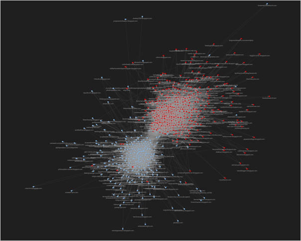
Adjust node color: In the Node tab, click the palette icon next to the Color option. Select the value column, which represents the political orientation of each blog. You will immediately see the node colors change accordingly.
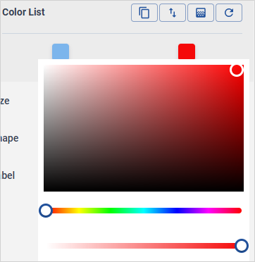
A value of 0 represents a liberal blog, while a value of 1 indicates a conservative blog. To customize the colors instead of using the default palette, click the color shown in the Color List and choose your preferred color — it will be immediately applied to the nodes.
Click the Theme Toggle icon in the upper-right corner to switch to dark mode.
To display the blog page name as the node label, go to the Label option and select page.
In the right control panel, click the Style tab.
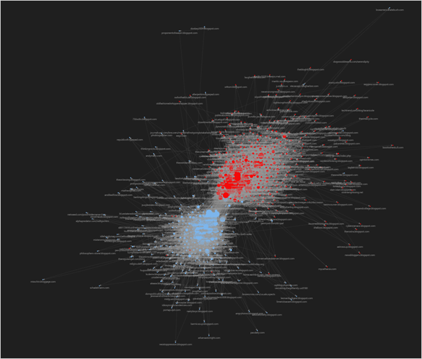
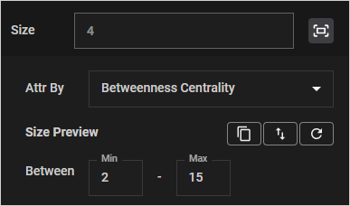
Adjust node size: In the Node tab, click the size icon next to the Size option. Select In-Degree Centrality, which was previously added to the nodes during analysis. You will see that nodes receiving more incoming links from other nodes appear larger.

In other words, these larger nodes can be interpreted as blogs that are frequently linked to or cited by others — serving as central sources of information and influential actors within the network.
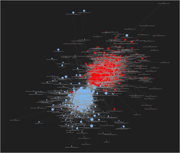
The following visualization reflects the results of betweenness centrality. Betweenness centrality measures how often a node lies on the shortest paths between pairs of other nodes. In other words, it indicates how important a node is as a mediator or conduit in the flow of information, resources, or influence.
Nodes that appear larger are likely serving as bridges between the liberal and conservative communities, and are frequently referenced or cited by both sides.
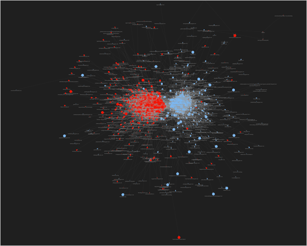
The following visualization reflects the results of closeness centrality. Closeness centrality measures how close a node is to all other nodes in the network — that is, how quickly other nodes can reach this node.

Nodes that appear larger are likely blogs that can be reached in fewer steps, meaning they may serve as central hubs where information is concentrated or disseminated efficiently.
With NetMiner 5, you can easily perform key network analysis methods such as centrality analysis and cohesive group analysis, and quickly apply the results to visualizations—allowing you to intuitively grasp complex network structures at a glance.
Now, try using NetMiner 5 to customize your visualizations with the styles you prefer, integrate them seamlessly into your analysis workflow, and achieve more insightful and effective results.
※ Related Tutorial
☞Where Is the Latest AI Research Headed? Analyzing Key Researchers from 1,000 International Papers
☞Where Is the Latest AI Research Headed? Core AI Keywords and Major Topics from International Papers